Image Credit:
Adapted by Deb Streusand from "Cookie" by Sonoftroll
As part of the rhetorical analysis unit in my Rhetoric and Writing class, I created a lesson that, because I like terrible puns, I called "The Logos of Logos." My goal was to introduce the students to the idea of visual rhetoric, with an emphasis on drawing out implied arguments from images. I've written this experience up as a blog rather than a lesson plan because I find what happened in the classroom far more interesting than my original lesson plan. I'll first lay out the progress of the original lesson plan, then describe how I adapted it on the fly due to having more time than I expected, and the intriguing conversation that followed.
I began by showing the students the Walmart smiley face logo:
Image credit: personal.psu.edu/tqs5262/blogs
I asked them to point out the premises and conclusion of the argument it makes, which they did ably: shopping at Walmart makes you happy, you want to be happy, therefore you should shop at Walmart.
Next, we looked at two video advertisements depicting the smiley logo in different guises.
The first advertisement added a construction helmet to the smiley, paired it with the slogan "working hard to save you money," and showed him using a saw to cut back the prices on Walmart signs:
The students quickly identified the appeal to ethos the ad created by suggesting that Walmart works hard to save you money. They discussed how this appeal to ethos became one of the premises of a logical enthymeme when combined with an implied premise about the audience: Walmart saves you money, you want to save money, therefore you want to shop at Walmart. At this point, I was already wondering how I'd fill up the rest of the class period, because the students were picking up on the arguments much more quickly than I'd expected.
They were equally adept at analyzing the next video, which featured a leather-gloved, bow-tied smiley firing lasers at the pricing signs:
I asked them: "what associations does our culture have with leather gloves and lasers?" "It's badass!" cried a student. Another pointed out that this was an appeal to pathos as well as to ethos: you want to be badass, so shop at Walmart.
This was 20 minutes into a 75-minute class, and I had only one more trick up my sleeve:
Image credit: chicshadesofgreen.com
Not only did the students rapidly dissect the effects of pairing the slogan with the smiley face image, but they noted something I hadn't caught: the addition of slanted eyebrows to make the smiley face look more sinister. Already, they were better at analyzing visual rhetoric than I was. We were at the 30 minute mark. What to do?
Inspiration! Since they were so good at analyzing the arguments the logos made in their original and adapted versions, why not have them adapt a corporate logo themselves? I asked them to get on the computers, find a corporate logo of their own, and decide how they would adapt it to make a different argument. They had about 15 minutes to work and the remaining class time to go around and present their choices. Since I came up with this assignment on the spot, and I didn't know their level of Photoshop expertise, I didn't require them to make an actual image adapting the logo, but merely to decide and explain how they would adapt it. After each student described his or her adaptation of the logo, I would ask the class to deduce the argument that student was trying to make, and the student would confirm or correct the class's suggestions.
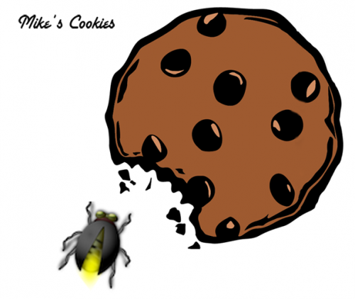
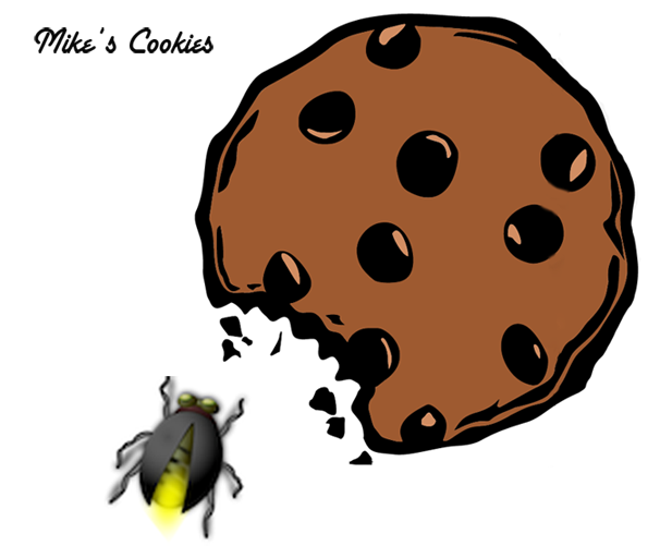
Lots of delightful images, both theoretical and actual, emerged from this assignment -- one of my favorites was an evil version of the Twitter bird, intended to imply that Twitter will ruin your reputation. The most interesting discussion, however, came out of a student's use of Photoshop to adapt the logo of a local cookie store by adding a bug. I've made my own version of this logo for a fictional cookie store:
The student's original image added a fly, which the class easily identified as creating an argument that implied the store was dirty. One student asked, "what would happen if you put a butterfly by the logo instead?" This question launched an impassioned discussion about the rhetorical implications of different types of bugs. "A butterfly is beautiful! That would create a positive image for the store!" "But it's still weird to have a bug by cookie..." The general consensus was that the butterfly's connotation was positive, though with some lingering dissenters. Then a student, my usual gadfly, smiled mischieviously. "How about a lightning bug?" The students went wild with laughter and then with discussion. They never did agree on exactly what the lightning bug would mean, but they were as excited about rhetoric as they'd been all semester. I left the classroom happy, and I think they did too.


